1// Copyright 2023 Google LLC 2// 3// Licensed under the Apache License, Version 2.0 (the "License"); 4// you may not use this file except in compliance with the License. 5// You may obtain a copy of the License at 6// 7// http://www.apache.org/licenses/LICENSE-2.0 8// 9// Unless required by applicable law or agreed to in writing, software 10// distributed under the License is distributed on an "AS IS" BASIS, 11// WITHOUT WARRANTIES OR CONDITIONS OF ANY KIND, either express or implied. 12// See the License for the specific language governing permissions and 13// limitations under the License. 14 15syntax = "proto3"; 16 17package google.apps.card.v1; 18 19import "google/type/color.proto"; 20 21option csharp_namespace = "Google.Apps.Card.V1"; 22option go_package = "google.golang.org/genproto/googleapis/apps/card/v1;card"; 23option java_multiple_files = true; 24option java_outer_classname = "CardProto"; 25option java_package = "com.google.apps.card.v1"; 26option php_namespace = "Google\\Apps\\Card\\V1"; 27option ruby_package = "Google::Apps::Card::V1"; 28 29// A card interface displayed in a Google Chat message or Google Workspace 30// Add-on. 31// 32// Cards support a defined layout, interactive UI elements like buttons, and 33// rich media like images. Use cards to present detailed information, 34// gather information from users, and guide users to take a next step. 35// 36// [Card builder](https://addons.gsuite.google.com/uikit/builder) 37// 38// To learn how 39// to build cards, see the following documentation: 40// 41// * For Google Chat apps, see [Design the components of a card or 42// dialog](https://developers.google.com/workspace/chat/design-components-card-dialog). 43// * For Google Workspace Add-ons, see [Card-based 44// interfaces](https://developers.google.com/apps-script/add-ons/concepts/cards). 45// 46// **Example: Card message for a Google Chat app** 47// 48// 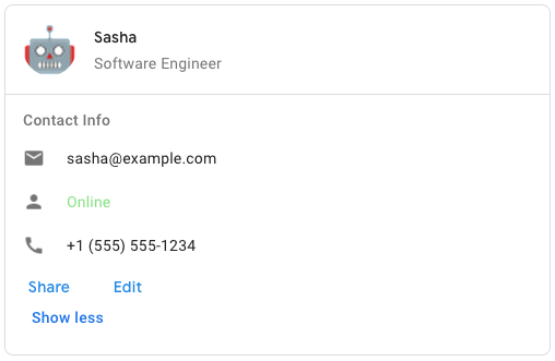 50// 51// To create the sample card message in Google Chat, use the following JSON: 52// 53// ``` 54// { 55// "cardsV2": [ 56// { 57// "cardId": "unique-card-id", 58// "card": { 59// "header": { 60// "title": "Sasha", 61// "subtitle": "Software Engineer", 62// "imageUrl": 63// "https://developers.google.com/workspace/chat/images/quickstart-app-avatar.png", 64// "imageType": "CIRCLE", 65// "imageAltText": "Avatar for Sasha" 66// }, 67// "sections": [ 68// { 69// "header": "Contact Info", 70// "collapsible": true, 71// "uncollapsibleWidgetsCount": 1, 72// "widgets": [ 73// { 74// "decoratedText": { 75// "startIcon": { 76// "knownIcon": "EMAIL" 77// }, 78// "text": "[email protected]" 79// } 80// }, 81// { 82// "decoratedText": { 83// "startIcon": { 84// "knownIcon": "PERSON" 85// }, 86// "text": "<font color=\"#80e27e\">Online</font>" 87// } 88// }, 89// { 90// "decoratedText": { 91// "startIcon": { 92// "knownIcon": "PHONE" 93// }, 94// "text": "+1 (555) 555-1234" 95// } 96// }, 97// { 98// "buttonList": { 99// "buttons": [ 100// { 101// "text": "Share", 102// "onClick": { 103// "openLink": { 104// "url": "https://example.com/share" 105// } 106// } 107// }, 108// { 109// "text": "Edit", 110// "onClick": { 111// "action": { 112// "function": "goToView", 113// "parameters": [ 114// { 115// "key": "viewType", 116// "value": "EDIT" 117// } 118// ] 119// } 120// } 121// } 122// ] 123// } 124// } 125// ] 126// } 127// ] 128// } 129// } 130// ] 131// } 132// ``` 133message Card { 134 // Represents a card header. For an example in Google Chat apps, see [Add a 135 // header](https://developers.google.com/workspace/chat/design-components-card-dialog#add_a_header). 136 // 137 // [Google Workspace Add-ons and Chat 138 // apps](https://developers.google.com/workspace/extend): 139 message CardHeader { 140 // Required. The title of the card header. 141 // The header has a fixed height: if both a 142 // title and subtitle are specified, each takes up one line. If only the 143 // title is specified, it takes up both lines. 144 string title = 1; 145 146 // The subtitle of the card header. If specified, appears on its own line 147 // below the `title`. 148 string subtitle = 2; 149 150 // The shape used to crop the image. 151 // 152 // [Google Workspace Add-ons and Chat 153 // apps](https://developers.google.com/workspace/extend): 154 Widget.ImageType image_type = 3; 155 156 // The HTTPS URL of the image in the card header. 157 string image_url = 4; 158 159 // The alternative text of this image that's used for accessibility. 160 string image_alt_text = 5; 161 } 162 163 // A section contains a collection of widgets that are rendered 164 // vertically in the order that they're specified. 165 // 166 // [Google Workspace Add-ons and Chat 167 // apps](https://developers.google.com/workspace/extend): 168 message Section { 169 // Text that appears at the top of a section. 170 // Supports simple HTML formatted text. For more information 171 // about formatting text, see 172 // [Formatting text in Google Chat 173 // apps](https://developers.google.com/workspace/chat/format-messages#card-formatting) 174 // and 175 // [Formatting 176 // text in Google Workspace 177 // Add-ons](https://developers.google.com/apps-script/add-ons/concepts/widgets#text_formatting). 178 string header = 1; 179 180 // All the widgets in the section. 181 // Must contain at least one widget. 182 repeated Widget widgets = 2; 183 184 // Indicates whether this section is collapsible. 185 // 186 // Collapsible sections hide some or all widgets, but users can expand the 187 // section to reveal the hidden widgets by clicking **Show more**. Users 188 // can hide the widgets again by clicking **Show less**. 189 // 190 // To determine which widgets are hidden, specify 191 // `uncollapsibleWidgetsCount`. 192 bool collapsible = 5; 193 194 // The number of uncollapsible widgets which remain visible even when a 195 // section is collapsed. 196 // 197 // For example, when a section 198 // contains five widgets and the `uncollapsibleWidgetsCount` is set to `2`, 199 // the first two widgets are always shown and the last three are collapsed 200 // by default. The `uncollapsibleWidgetsCount` is taken into account only 201 // when `collapsible` is `true`. 202 int32 uncollapsible_widgets_count = 6; 203 } 204 205 // The divider style of a card. Currently only used for dividers betweens card 206 // sections. 207 // 208 // [Google Workspace Add-ons and Chat 209 // apps](https://developers.google.com/workspace/extend): 210 enum DividerStyle { 211 // Don't use. Unspecified. 212 DIVIDER_STYLE_UNSPECIFIED = 0; 213 214 // Default option. Render a solid divider between sections. 215 SOLID_DIVIDER = 1; 216 217 // If set, no divider is rendered between sections. 218 NO_DIVIDER = 2; 219 } 220 221 // A card action is the action associated with the card. For example, 222 // an invoice card might include actions such as delete invoice, email 223 // invoice, or open the invoice in a browser. 224 // 225 // [Google Workspace 226 // Add-ons](https://developers.google.com/workspace/add-ons): 227 message CardAction { 228 // The label that displays as the action menu item. 229 string action_label = 1; 230 231 // The `onClick` action for this action item. 232 OnClick on_click = 2; 233 } 234 235 // A persistent (sticky) footer that that appears at the bottom of the card. 236 // 237 // Setting `fixedFooter` without specifying a `primaryButton` or a 238 // `secondaryButton` causes an error. 239 // 240 // For Chat apps, you can use fixed footers in 241 // [dialogs](https://developers.google.com/workspace/chat/dialogs), but not 242 // [card 243 // messages](https://developers.google.com/workspace/chat/create-messages#create). 244 // For an example in Google Chat apps, see [Add a persistent 245 // footer](https://developers.google.com/workspace/chat/design-components-card-dialog#add_a_persistent_footer). 246 // 247 // [Google Workspace Add-ons and Chat 248 // apps](https://developers.google.com/workspace/extend): 249 message CardFixedFooter { 250 // The primary button of the fixed footer. The button must be a text button 251 // with text and color set. 252 Button primary_button = 1; 253 254 // The secondary button of the fixed footer. The button must be a text 255 // button with text and color set. 256 // If `secondaryButton` is set, you must also set `primaryButton`. 257 Button secondary_button = 2; 258 } 259 260 // In Google Workspace Add-ons, 261 // determines how a card is displayed. 262 // 263 // [Google Workspace 264 // Add-ons](https://developers.google.com/workspace/add-ons): 265 enum DisplayStyle { 266 // Don't use. Unspecified. 267 DISPLAY_STYLE_UNSPECIFIED = 0; 268 269 // The header of the card appears at the bottom of the 270 // sidebar, partially covering the current top card of the stack. Clicking 271 // the header pops the card into the card stack. If the card has no header, 272 // a generated header is used instead. 273 PEEK = 1; 274 275 // Default value. The card is shown by replacing the view of the top card in 276 // the card stack. 277 REPLACE = 2; 278 } 279 280 // The header of the card. A header usually contains a leading image and a 281 // title. Headers always appear at the top of a card. 282 CardHeader header = 1; 283 284 // Contains a collection of widgets. Each section has its own, optional 285 // header. Sections are visually separated by a line divider. For an example 286 // in Google Chat apps, see [Define a section of a 287 // card](https://developers.google.com/workspace/chat/design-components-card-dialog#define_a_section_of_a_card). 288 repeated Section sections = 2; 289 290 // The divider style between sections. 291 DividerStyle section_divider_style = 9; 292 293 // The card's actions. Actions are added to the card's toolbar menu. 294 // 295 // [Google Workspace 296 // Add-ons](https://developers.google.com/workspace/add-ons): 297 // 298 // For example, the following JSON constructs a card action menu with 299 // `Settings` and `Send Feedback` options: 300 // 301 // ``` 302 // "card_actions": [ 303 // { 304 // "actionLabel": "Settings", 305 // "onClick": { 306 // "action": { 307 // "functionName": "goToView", 308 // "parameters": [ 309 // { 310 // "key": "viewType", 311 // "value": "SETTING" 312 // } 313 // ], 314 // "loadIndicator": "LoadIndicator.SPINNER" 315 // } 316 // } 317 // }, 318 // { 319 // "actionLabel": "Send Feedback", 320 // "onClick": { 321 // "openLink": { 322 // "url": "https://example.com/feedback" 323 // } 324 // } 325 // } 326 // ] 327 // ``` 328 repeated CardAction card_actions = 3; 329 330 // Name of the card. Used as a card identifier in card navigation. 331 // 332 // [Google Workspace 333 // Add-ons](https://developers.google.com/workspace/add-ons): 334 string name = 4; 335 336 // The fixed footer shown at the bottom of this card. 337 // 338 // Setting `fixedFooter` without specifying a `primaryButton` or a 339 // `secondaryButton` causes an error. For Chat apps, you can use fixed footers 340 // in 341 // [dialogs](https://developers.google.com/workspace/chat/dialogs), but not 342 // [card 343 // messages](https://developers.google.com/workspace/chat/create-messages#create). 344 // 345 // [Google Workspace Add-ons and Chat 346 // apps](https://developers.google.com/workspace/extend): 347 CardFixedFooter fixed_footer = 5; 348 349 // In Google Workspace Add-ons, sets the display properties of the 350 // `peekCardHeader`. 351 // 352 // [Google Workspace 353 // Add-ons](https://developers.google.com/workspace/add-ons): 354 DisplayStyle display_style = 6; 355 356 // When displaying contextual content, the peek card header acts as a 357 // placeholder so that the user can navigate forward between the homepage 358 // cards and the contextual cards. 359 // 360 // [Google Workspace 361 // Add-ons](https://developers.google.com/workspace/add-ons): 362 CardHeader peek_card_header = 7; 363} 364 365// Each card is made up of widgets. 366// 367// A widget is a composite object that can represent one of text, images, 368// buttons, and other object types. 369message Widget { 370 // The shape used to crop the image. 371 // 372 // [Google Workspace Add-ons and Chat 373 // apps](https://developers.google.com/workspace/extend): 374 enum ImageType { 375 // Default value. Applies a square mask to the image. For example, a 4x3 376 // image becomes 3x3. 377 SQUARE = 0; 378 379 // Applies a circular mask to the image. For example, a 4x3 image becomes a 380 // circle with a diameter of 3. 381 CIRCLE = 1; 382 } 383 384 // Specifies whether widgets align to the left, right, or center of a column. 385 // 386 // [Google Chat apps](https://developers.google.com/workspace/chat): 387 enum HorizontalAlignment { 388 // Don't use. Unspecified. 389 HORIZONTAL_ALIGNMENT_UNSPECIFIED = 0; 390 391 // Default value. Aligns widgets to the start position of the column. For 392 // left-to-right layouts, aligns to the left. For right-to-left layouts, 393 // aligns to the right. 394 START = 1; 395 396 // Aligns widgets to the center of the column. 397 CENTER = 2; 398 399 // Aligns widgets to the end position of the column. For left-to-right 400 // layouts, aligns widgets to the right. For right-to-left layouts, aligns 401 // widgets to the left. 402 END = 3; 403 } 404 405 // A widget can only have one of the following items. You can use multiple 406 // widget fields to display more items. 407 oneof data { 408 // Displays a text paragraph. Supports simple HTML formatted text. For more 409 // information about formatting text, see 410 // [Formatting text in Google Chat 411 // apps](https://developers.google.com/workspace/chat/format-messages#card-formatting) 412 // and 413 // [Formatting 414 // text in Google Workspace 415 // Add-ons](https://developers.google.com/apps-script/add-ons/concepts/widgets#text_formatting). 416 // 417 // For example, the following JSON creates a bolded text: 418 // ``` 419 // "textParagraph": { 420 // "text": " <b>bold text</b>" 421 // } 422 // ``` 423 TextParagraph text_paragraph = 1; 424 425 // Displays an image. 426 // 427 // For example, the following JSON creates an image with alternative text: 428 // ``` 429 // "image": { 430 // "imageUrl": 431 // "https://developers.google.com/workspace/chat/images/quickstart-app-avatar.png", 432 // "altText": "Chat app avatar" 433 // } 434 // ``` 435 Image image = 2; 436 437 // Displays a decorated text item. 438 // 439 // For example, the following JSON creates a decorated text widget showing 440 // email address: 441 // 442 // ``` 443 // "decoratedText": { 444 // "icon": { 445 // "knownIcon": "EMAIL" 446 // }, 447 // "topLabel": "Email Address", 448 // "text": "[email protected]", 449 // "bottomLabel": "This is a new Email address!", 450 // "switchControl": { 451 // "name": "has_send_welcome_email_to_sasha", 452 // "selected": false, 453 // "controlType": "CHECKBOX" 454 // } 455 // } 456 // ``` 457 DecoratedText decorated_text = 3; 458 459 // A list of buttons. 460 // 461 // For example, the following JSON creates two buttons. The first 462 // is a blue text button and the second is an image button that opens a 463 // link: 464 // ``` 465 // "buttonList": { 466 // "buttons": [ 467 // { 468 // "text": "Edit", 469 // "color": { 470 // "red": 0, 471 // "green": 0, 472 // "blue": 1, 473 // "alpha": 1 474 // }, 475 // "disabled": true, 476 // }, 477 // { 478 // "icon": { 479 // "knownIcon": "INVITE", 480 // "altText": "check calendar" 481 // }, 482 // "onClick": { 483 // "openLink": { 484 // "url": "https://example.com/calendar" 485 // } 486 // } 487 // } 488 // ] 489 // } 490 // ``` 491 ButtonList button_list = 4; 492 493 // Displays a text box that users can type into. 494 // 495 // For example, the following JSON creates a text input for an email 496 // address: 497 // 498 // ``` 499 // "textInput": { 500 // "name": "mailing_address", 501 // "label": "Mailing Address" 502 // } 503 // ``` 504 // 505 // As another example, the following JSON creates a text input for a 506 // programming language with static suggestions: 507 // ``` 508 // "textInput": { 509 // "name": "preferred_programing_language", 510 // "label": "Preferred Language", 511 // "initialSuggestions": { 512 // "items": [ 513 // { 514 // "text": "C++" 515 // }, 516 // { 517 // "text": "Java" 518 // }, 519 // { 520 // "text": "JavaScript" 521 // }, 522 // { 523 // "text": "Python" 524 // } 525 // ] 526 // } 527 // } 528 // ``` 529 TextInput text_input = 5; 530 531 // Displays a selection control that lets users select items. Selection 532 // controls can be checkboxes, radio buttons, switches, or dropdown menus. 533 // 534 // For example, the following JSON creates a dropdown menu that lets users 535 // choose a size: 536 // 537 // ``` 538 // "selectionInput": { 539 // "name": "size", 540 // "label": "Size" 541 // "type": "DROPDOWN", 542 // "items": [ 543 // { 544 // "text": "S", 545 // "value": "small", 546 // "selected": false 547 // }, 548 // { 549 // "text": "M", 550 // "value": "medium", 551 // "selected": true 552 // }, 553 // { 554 // "text": "L", 555 // "value": "large", 556 // "selected": false 557 // }, 558 // { 559 // "text": "XL", 560 // "value": "extra_large", 561 // "selected": false 562 // } 563 // ] 564 // } 565 // ``` 566 SelectionInput selection_input = 6; 567 568 // Displays a widget that lets users input a date, time, or date and time. 569 // 570 // For example, the following JSON creates a date time picker to schedule an 571 // appointment: 572 // 573 // 574 // ``` 575 // "dateTimePicker": { 576 // "name": "appointment_time", 577 // "label": "Book your appointment at:", 578 // "type": "DATE_AND_TIME", 579 // "valueMsEpoch": "796435200000" 580 // } 581 // ``` 582 DateTimePicker date_time_picker = 7; 583 584 // Displays a horizontal line divider between widgets. 585 // 586 // For example, the following JSON creates a divider: 587 // ``` 588 // "divider": { 589 // } 590 // ``` 591 Divider divider = 9; 592 593 // Displays a grid with a collection of items. 594 // 595 // A grid supports any number of columns and items. The number of rows is 596 // determined by the upper bounds of the number items divided by the number 597 // of columns. A grid with 10 items and 2 columns has 5 rows. A grid with 11 598 // items and 2 columns has 6 rows. 599 // 600 // [Google Workspace Add-ons and 601 // Chat apps](https://developers.google.com/workspace/extend): 602 // 603 // For example, the following JSON creates a 2 column grid with a single 604 // item: 605 // 606 // ``` 607 // "grid": { 608 // "title": "A fine collection of items", 609 // "columnCount": 2, 610 // "borderStyle": { 611 // "type": "STROKE", 612 // "cornerRadius": 4 613 // }, 614 // "items": [ 615 // { 616 // "image": { 617 // "imageUri": "https://www.example.com/image.png", 618 // "cropStyle": { 619 // "type": "SQUARE" 620 // }, 621 // "borderStyle": { 622 // "type": "STROKE" 623 // } 624 // }, 625 // "title": "An item", 626 // "textAlignment": "CENTER" 627 // } 628 // ], 629 // "onClick": { 630 // "openLink": { 631 // "url": "https://www.example.com" 632 // } 633 // } 634 // } 635 // ``` 636 Grid grid = 10; 637 638 // Displays up to 2 columns. 639 // 640 // To include more than 2 columns, or to use rows, use the `Grid` widget. 641 // 642 // For example, the following JSON creates 2 columns that each contain 643 // text paragraphs: 644 // 645 // ``` 646 // "columns": { 647 // "columnItems": [ 648 // { 649 // "horizontalSizeStyle": "FILL_AVAILABLE_SPACE", 650 // "horizontalAlignment": "CENTER", 651 // "verticalAlignment": "CENTER", 652 // "widgets": [ 653 // { 654 // "textParagraph": { 655 // "text": "First column text paragraph" 656 // } 657 // } 658 // ] 659 // }, 660 // { 661 // "horizontalSizeStyle": "FILL_AVAILABLE_SPACE", 662 // "horizontalAlignment": "CENTER", 663 // "verticalAlignment": "CENTER", 664 // "widgets": [ 665 // { 666 // "textParagraph": { 667 // "text": "Second column text paragraph" 668 // } 669 // } 670 // ] 671 // } 672 // ] 673 // } 674 // ``` 675 Columns columns = 11; 676 } 677 678 // Specifies whether widgets align to the left, right, or center of a column. 679 HorizontalAlignment horizontal_alignment = 8; 680} 681 682// A paragraph of text that supports formatting. For an example in 683// Google Chat apps, see [Add a paragraph of formatted 684// text](https://developers.google.com/workspace/chat/add-text-image-card-dialog#add_a_paragraph_of_formatted_text). 685// For more information 686// about formatting text, see 687// [Formatting text in Google Chat 688// apps](https://developers.google.com/workspace/chat/format-messages#card-formatting) 689// and 690// [Formatting 691// text in Google Workspace 692// Add-ons](https://developers.google.com/apps-script/add-ons/concepts/widgets#text_formatting). 693// 694// [Google Workspace Add-ons and 695// Chat apps](https://developers.google.com/workspace/extend): 696message TextParagraph { 697 // The text that's shown in the widget. 698 string text = 1; 699} 700 701// An image that is specified by a URL and can have an `onClick` action. For an 702// example, see [Add an 703// image](https://developers.google.com/workspace/chat/add-text-image-card-dialog#add_an_image). 704// 705// [Google Workspace Add-ons and Chat 706// apps](https://developers.google.com/workspace/extend): 707message Image { 708 // The HTTPS URL that hosts the image. 709 // 710 // For example: 711 // 712 // ``` 713 // https://developers.google.com/workspace/chat/images/quickstart-app-avatar.png 714 // ``` 715 string image_url = 1; 716 717 // When a user clicks the image, the click triggers this action. 718 OnClick on_click = 2; 719 720 // The alternative text of this image that's used for accessibility. 721 string alt_text = 3; 722} 723 724// Displays a divider between widgets as a horizontal line. For an example in 725// Google Chat apps, see 726// [Add a horizontal divider between 727// widgets](https://developers.google.com/workspace/chat/format-structure-card-dialog#add_a_horizontal_divider_between_widgets). 728// 729// [Google Workspace Add-ons and Chat 730// apps](https://developers.google.com/workspace/extend): 731// 732// For example, the following JSON creates a divider: 733// 734// ``` 735// "divider": {} 736// ``` 737message Divider {} 738 739// A widget that displays text with optional decorations such as a label above 740// or below the text, an icon in front of the text, a selection widget, or a 741// button after the text. For an example in 742// Google Chat apps, see [Display text with decorative 743// text](https://developers.google.com/workspace/chat/add-text-image-card-dialog#display_text_with_decorative_elements). 744// 745// [Google Workspace Add-ons and Chat 746// apps](https://developers.google.com/workspace/extend): 747message DecoratedText { 748 // Either a toggle-style switch or a checkbox inside a `decoratedText` widget. 749 // 750 // [Google Workspace Add-ons and Chat 751 // apps](https://developers.google.com/workspace/extend): 752 // 753 // Only supported in the `decoratedText` widget. 754 message SwitchControl { 755 // How the switch appears in the user interface. 756 // 757 // [Google Workspace Add-ons 758 // and Chat apps](https://developers.google.com/workspace/extend): 759 enum ControlType { 760 // A toggle-style switch. 761 SWITCH = 0; 762 763 // Deprecated in favor of `CHECK_BOX`. 764 CHECKBOX = 1; 765 766 // A checkbox. 767 CHECK_BOX = 2; 768 } 769 770 // The name by which the switch widget is identified in a form input event. 771 // 772 // For details about working with form inputs, see [Receive form 773 // data](https://developers.google.com/workspace/chat/read-form-data). 774 string name = 1; 775 776 // The value entered by a user, returned as part of a form input event. 777 // 778 // For details about working with form inputs, see [Receive form 779 // data](https://developers.google.com/workspace/chat/read-form-data). 780 string value = 2; 781 782 // When `true`, the switch is selected. 783 bool selected = 3; 784 785 // The action to perform when the switch state is changed, such as what 786 // function to run. 787 Action on_change_action = 4; 788 789 // How the switch appears in the user interface. 790 // 791 // [Google Workspace Add-ons 792 // and Chat apps](https://developers.google.com/workspace/extend): 793 ControlType control_type = 5; 794 } 795 796 // Deprecated in favor of `startIcon`. 797 Icon icon = 1 [deprecated = true]; 798 799 // The icon displayed in front of the text. 800 Icon start_icon = 12; 801 802 // The text that appears above `text`. Always truncates. 803 string top_label = 3; 804 805 // Required. The primary text. 806 // 807 // Supports simple formatting. For more information 808 // about formatting text, see 809 // [Formatting text in Google Chat 810 // apps](https://developers.google.com/workspace/chat/format-messages#card-formatting) 811 // and 812 // [Formatting 813 // text in Google Workspace 814 // Add-ons](https://developers.google.com/apps-script/add-ons/concepts/widgets#text_formatting). 815 string text = 4; 816 817 // The wrap text setting. If `true`, the text wraps and displays on 818 // multiple lines. Otherwise, the text is truncated. 819 // 820 // Only applies to `text`, not `topLabel` and `bottomLabel`. 821 bool wrap_text = 5; 822 823 // The text that appears below `text`. Always wraps. 824 string bottom_label = 6; 825 826 // This action is triggered when users click `topLabel` or `bottomLabel`. 827 OnClick on_click = 7; 828 829 // A button, switch, checkbox, or image that appears to the right-hand side 830 // of text in the `decoratedText` widget. 831 oneof control { 832 // A button that a user can click to trigger an action. 833 Button button = 8; 834 835 // A switch widget that a user can click to change its state and trigger an 836 // action. 837 SwitchControl switch_control = 9; 838 839 // An icon displayed after the text. 840 // 841 // Supports 842 // [built-in](https://developers.google.com/workspace/chat/format-messages#builtinicons) 843 // and 844 // [custom](https://developers.google.com/workspace/chat/format-messages#customicons) 845 // icons. 846 Icon end_icon = 11; 847 } 848} 849 850// A field in which users can enter text. Supports suggestions and on-change 851// actions. For an example in Google Chat apps, see [Add a field in which a user 852// can enter 853// text](https://developers.google.com/workspace/chat/design-interactive-card-dialog#add_a_field_in_which_a_user_can_enter_text). 854// 855// Chat apps receive and can process the value of entered text during form input 856// events. For details about working with form inputs, see [Receive form 857// data](https://developers.google.com/workspace/chat/read-form-data). 858// 859// When you need to collect undefined or abstract data from users, 860// use a text input. To collect defined or enumerated data from users, use the 861// [SelectionInput][google.apps.card.v1.SelectionInput] widget. 862// 863// [Google Workspace Add-ons and Chat 864// apps](https://developers.google.com/workspace/extend): 865message TextInput { 866 // How a text input field appears in the user interface. For example, 867 // whether it's a single line input field, or a multi-line input. If 868 // `initialSuggestions` is specified, `type` is always `SINGLE_LINE`, 869 // even if it's set to `MULTIPLE_LINE`. 870 // 871 // [Google Workspace Add-ons and Chat 872 // apps](https://developers.google.com/workspace/extend): 873 enum Type { 874 // The text input field has a fixed height of one line. 875 SINGLE_LINE = 0; 876 877 // The text input field has a fixed height of multiple lines. 878 MULTIPLE_LINE = 1; 879 } 880 881 // The name by which the text input is identified in a form input event. 882 // 883 // For details about working with form inputs, see [Receive form 884 // data](https://developers.google.com/workspace/chat/read-form-data). 885 string name = 1; 886 887 // The text that appears above the text input field in the user interface. 888 // 889 // Specify text that helps the user enter the information your app needs. 890 // For example, if you are asking someone's name, but specifically need their 891 // surname, write `surname` instead of `name`. 892 // 893 // Required if `hintText` is unspecified. Otherwise, optional. 894 string label = 2; 895 896 // Text that appears below the text input field meant to assist users by 897 // prompting them to enter a certain value. This text is always visible. 898 // 899 // Required if `label` is unspecified. Otherwise, optional. 900 string hint_text = 3; 901 902 // The value entered by a user, returned as part of a form input event. 903 // 904 // For details about working with form inputs, see [Receive form 905 // data](https://developers.google.com/workspace/chat/read-form-data). 906 string value = 4; 907 908 // How a text input field appears in the user interface. 909 // For example, whether the field is single or multi-line. 910 Type type = 5; 911 912 // What to do when a change occurs in the text input field. For example, a 913 // user adding to the field or deleting text. 914 // 915 // Examples of actions to take include running a custom function or opening 916 // a [dialog](https://developers.google.com/workspace/chat/dialogs) 917 // in Google Chat. 918 Action on_change_action = 6; 919 920 // Suggested values that users can enter. These values appear when users click 921 // inside the text input field. As users type, the suggested values 922 // dynamically filter to match what the users have typed. 923 // 924 // For example, a text input field for programming language might suggest 925 // Java, JavaScript, Python, and C++. When users start typing `Jav`, the list 926 // of suggestions filters to show just `Java` and `JavaScript`. 927 // 928 // Suggested values help guide users to enter values that your app can make 929 // sense of. When referring to JavaScript, some users might enter `javascript` 930 // and others `java script`. Suggesting `JavaScript` can standardize how users 931 // interact with your app. 932 // 933 // When specified, `TextInput.type` is always `SINGLE_LINE`, even if it's set 934 // to `MULTIPLE_LINE`. 935 // 936 // [Google Workspace 937 // Add-ons and Chat apps](https://developers.google.com/workspace/extend): 938 Suggestions initial_suggestions = 7; 939 940 // Optional. Specify what action to take when the text input field provides 941 // suggestions to users who interact with it. 942 // 943 // If unspecified, the suggestions are set by `initialSuggestions` and 944 // are processed by the client. 945 // 946 // If specified, the app takes the action specified here, such as running 947 // a custom function. 948 // 949 // [Google Workspace 950 // Add-ons](https://developers.google.com/workspace/add-ons): 951 Action auto_complete_action = 8; 952 953 // Text that appears in the text input field when the field is empty. 954 // Use this text to prompt users to enter a value. For example, `Enter a 955 // number from 0 to 100`. 956 // 957 // [Google Chat apps](https://developers.google.com/workspace/chat): 958 string placeholder_text = 12; 959} 960 961// Suggested values that users can enter. These values appear when users click 962// inside the text input field. As users type, the suggested values 963// dynamically filter to match what the users have typed. 964// 965// For example, a text input field for programming language might suggest 966// Java, JavaScript, Python, and C++. When users start typing `Jav`, the list 967// of suggestions filters to show `Java` and `JavaScript`. 968// 969// Suggested values help guide users to enter values that your app can make 970// sense of. When referring to JavaScript, some users might enter `javascript` 971// and others `java script`. Suggesting `JavaScript` can standardize how users 972// interact with your app. 973// 974// When specified, `TextInput.type` is always `SINGLE_LINE`, even if it's set 975// to `MULTIPLE_LINE`. 976// 977// [Google Workspace 978// Add-ons and Chat apps](https://developers.google.com/workspace/extend): 979message Suggestions { 980 // One suggested value that users can enter in a text input field. 981 // 982 // [Google Workspace Add-ons and Chat 983 // apps](https://developers.google.com/workspace/extend): 984 message SuggestionItem { 985 oneof content { 986 // The value of a suggested input to a text input field. This is 987 // equivalent to what users enter themselves. 988 string text = 1; 989 } 990 } 991 992 // A list of suggestions used for autocomplete recommendations in text input 993 // fields. 994 repeated SuggestionItem items = 1; 995} 996 997// A list of buttons layed out horizontally. For an example in 998// Google Chat apps, see 999// [Add a 1000// button](https://developers.google.com/workspace/chat/design-interactive-card-dialog#add_a_button). 1001// 1002// [Google Workspace Add-ons and Chat 1003// apps](https://developers.google.com/workspace/extend): 1004message ButtonList { 1005 // An array of buttons. 1006 repeated Button buttons = 1; 1007} 1008 1009// A widget that creates one or more UI items that users can select. 1010// For example, a dropdown menu or checkboxes. You can use this widget to 1011// collect data that can be predicted or enumerated. For an example in Google 1012// Chat apps, see [Add selectable UI 1013// elements](/workspace/chat/design-interactive-card-dialog#add_selectable_ui_elements). 1014// 1015// Chat apps can process the value of items that users select or input. For 1016// details about working with form inputs, see [Receive form 1017// data](https://developers.google.com/workspace/chat/read-form-data). 1018// 1019// To collect undefined or abstract data from users, use 1020// the [TextInput][google.apps.card.v1.TextInput] widget. 1021// 1022// [Google Workspace Add-ons 1023// and Chat apps](https://developers.google.com/workspace/extend): 1024message SelectionInput { 1025 // The format for the items that users can select. Different options support 1026 // different types of interactions. For example, users can select multiple 1027 // checkboxes, but can only select one item from a dropdown menu. 1028 // 1029 // Each selection input supports one type of selection. Mixing checkboxes 1030 // and switches, for example, isn't supported. 1031 // 1032 // [Google Workspace Add-ons and Chat 1033 // apps](https://developers.google.com/workspace/extend): 1034 enum SelectionType { 1035 // A set of checkboxes. Users can select one or more checkboxes. 1036 CHECK_BOX = 0; 1037 1038 // A set of radio buttons. Users can select one radio button. 1039 RADIO_BUTTON = 1; 1040 1041 // A set of switches. Users can turn on one or more switches. 1042 SWITCH = 2; 1043 1044 // A dropdown menu. Users can select one item from the menu. 1045 DROPDOWN = 3; 1046 1047 // A multiselect menu for static or dynamic data. From the menu bar, 1048 // users select one or more items. Users can also input values to populate 1049 // dynamic data. For example, users can start typing the name of a Google 1050 // Chat space and the widget autosuggests the space. 1051 // 1052 // To populate items for a multiselect menu, you can use one of the 1053 // following types of data sources: 1054 // 1055 // * Static data: Items are specified as `SelectionItem` objects in the 1056 // widget. Up to 100 items. 1057 // * Google Workspace data: Items are populated using data from Google 1058 // Workspace, such as Google Workspace users or Google Chat spaces. 1059 // * External data: Items are populated from an external data 1060 // source outside of Google Workspace. 1061 // 1062 // For examples of how to implement multiselect menus, see 1063 // [Add a multiselect 1064 // menu](https://developers.google.com/workspace/chat/design-interactive-card-dialog#multiselect-menu). 1065 // 1066 // [Google Workspace Add-ons and Chat 1067 // apps](https://developers.google.com/workspace/extend): 1068 // Multiselect for Google Workspace Add-ons are in 1069 // Developer Preview. 1070 MULTI_SELECT = 4; 1071 } 1072 1073 // An item that users can select in a selection input, such as a checkbox 1074 // or switch. 1075 // 1076 // [Google Workspace Add-ons and Chat 1077 // apps](https://developers.google.com/workspace/extend): 1078 message SelectionItem { 1079 // The text that identifies or describes the item to users. 1080 string text = 1; 1081 1082 // The value associated with this item. The client should use this as a form 1083 // input value. 1084 // 1085 // For details about working with form inputs, see [Receive form 1086 // data](https://developers.google.com/workspace/chat/read-form-data). 1087 string value = 2; 1088 1089 // Whether the item is selected by default. If the selection input only 1090 // accepts one value (such as for radio buttons or a dropdown menu), only 1091 // set this field for one item. 1092 bool selected = 3; 1093 1094 // For multiselect menus, the URL for the icon displayed next to 1095 // the item's `text` field. Supports PNG and JPEG files. Must be an `HTTPS` 1096 // URL. For example, 1097 // `https://developers.google.com/workspace/chat/images/quickstart-app-avatar.png`. 1098 string start_icon_uri = 4; 1099 1100 // For multiselect menus, a text description or label that's 1101 // displayed below the item's `text` field. 1102 string bottom_text = 5; 1103 } 1104 1105 // For a 1106 // [`SelectionInput`][google.apps.card.v1.SelectionInput] widget that uses a 1107 // multiselect menu, a data source from Google Workspace. Used to populate 1108 // items in a multiselect menu. 1109 // 1110 // [Google Chat apps](https://developers.google.com/workspace/chat): 1111 message PlatformDataSource { 1112 // A data source shared by all [Google Workspace 1113 // applications] 1114 // (https://developers.google.com/workspace/chat/api/reference/rest/v1/HostApp). 1115 // 1116 // [Google Chat apps](https://developers.google.com/workspace/chat): 1117 enum CommonDataSource { 1118 // Default value. Don't use. 1119 UNKNOWN = 0; 1120 1121 // Google Workspace users. The user can only view and select users from 1122 // their Google Workspace organization. 1123 USER = 1; 1124 } 1125 1126 // The data source. 1127 oneof data_source { 1128 // A data source shared by all Google Workspace applications, such as 1129 // users in a Google Workspace organization. 1130 CommonDataSource common_data_source = 1; 1131 } 1132 } 1133 1134 // The name that identifies the selection input in a form input event. 1135 // 1136 // For details about working with form inputs, see [Receive form 1137 // data](https://developers.google.com/workspace/chat/read-form-data). 1138 string name = 1; 1139 1140 // The text that appears above the selection input field in the user 1141 // interface. 1142 // 1143 // Specify text that helps the user enter the information your app needs. 1144 // For example, if users are selecting the urgency of a work ticket from a 1145 // drop-down menu, the label might be "Urgency" or "Select urgency". 1146 string label = 2; 1147 1148 // The type of items that are displayed to users in a `SelectionInput` widget. 1149 // Selection types support different types of interactions. For example, users 1150 // can select one or more checkboxes, but they can only select one value from 1151 // a dropdown menu. 1152 SelectionType type = 3; 1153 1154 // An array of selectable items. For example, an array of radio buttons or 1155 // checkboxes. Supports up to 100 items. 1156 repeated SelectionItem items = 4; 1157 1158 // If specified, the form is submitted when the selection changes. If not 1159 // specified, you must specify a separate button that submits the form. 1160 // 1161 // For details about working with form inputs, see [Receive form 1162 // data](https://developers.google.com/workspace/chat/read-form-data). 1163 Action on_change_action = 5; 1164 1165 // For multiselect menus, the maximum number of items that a user can select. 1166 // Minimum value is 1 item. If unspecified, defaults to 3 items. 1167 int32 multi_select_max_selected_items = 6; 1168 1169 // For multiselect menus, the number of text characters that a user inputs 1170 // before the app queries autocomplete and displays suggested items 1171 // in the menu. 1172 // 1173 // If unspecified, defaults to 0 characters for static data sources and 3 1174 // characters for external data sources. 1175 int32 multi_select_min_query_length = 7; 1176 1177 // For a multiselect menu, the data source that populates 1178 // selection items. 1179 // 1180 // [Google Chat apps](https://developers.google.com/workspace/chat): 1181 oneof multi_select_data_source { 1182 // An external data source, such as a relational data base. 1183 Action external_data_source = 8; 1184 1185 // A data source from Google Workspace. 1186 PlatformDataSource platform_data_source = 9; 1187 } 1188} 1189 1190// Lets users input a date, a time, or both a date and a time. For an example in 1191// Google Chat apps, see [Let a user pick a date and 1192// time](https://developers.google.com/workspace/chat/design-interactive-card-dialog#let_a_user_pick_a_date_and_time). 1193// 1194// Users can input text or use the picker to select dates and times. If users 1195// input an invalid date or time, the picker shows an error that prompts users 1196// to input the information correctly. 1197// 1198// [Google Workspace 1199// Add-ons and Chat apps](https://developers.google.com/workspace/extend): 1200message DateTimePicker { 1201 // The format for the date and time in the `DateTimePicker` widget. 1202 // Determines whether users can input a date, a time, or both a date and time. 1203 // 1204 // [Google Workspace Add-ons and Chat 1205 // apps](https://developers.google.com/workspace/extend): 1206 enum DateTimePickerType { 1207 // Users input a date and time. 1208 DATE_AND_TIME = 0; 1209 1210 // Users input a date. 1211 DATE_ONLY = 1; 1212 1213 // Users input a time. 1214 TIME_ONLY = 2; 1215 } 1216 1217 // The name by which the `DateTimePicker` is identified in a form input event. 1218 // 1219 // For details about working with form inputs, see [Receive form 1220 // data](https://developers.google.com/workspace/chat/read-form-data). 1221 string name = 1; 1222 1223 // The text that prompts users to input a date, a time, or a date and time. 1224 // For example, if users are scheduling an appointment, use a label such as 1225 // `Appointment date` or `Appointment date and time`. 1226 string label = 2; 1227 1228 // Whether the widget supports inputting a date, a time, or the date and time. 1229 DateTimePickerType type = 3; 1230 1231 // The default value displayed in the widget, in milliseconds since [Unix 1232 // epoch time](https://en.wikipedia.org/wiki/Unix_time). 1233 // 1234 // Specify the value based on the type of picker (`DateTimePickerType`): 1235 // 1236 // * `DATE_AND_TIME`: a calendar date and time in UTC. For example, to 1237 // represent January 1, 2023 at 12:00 PM UTC, use `1672574400000`. 1238 // * `DATE_ONLY`: a calendar date at 00:00:00 UTC. For example, to represent 1239 // January 1, 2023, use `1672531200000`. 1240 // * `TIME_ONLY`: a time in UTC. For example, to represent 12:00 PM, use 1241 // `43200000` (or `12 * 60 * 60 * 1000`). 1242 int64 value_ms_epoch = 4; 1243 1244 // The number representing the time zone offset from UTC, in minutes. 1245 // If set, the `value_ms_epoch` is displayed in the specified time zone. 1246 // If unset, the value defaults to the user's time zone setting. 1247 int32 timezone_offset_date = 5; 1248 1249 // Triggered when the user clicks **Save** or **Clear** from the 1250 // `DateTimePicker` interface. 1251 Action on_change_action = 6; 1252} 1253 1254// A text, icon, or text and icon button that users can click. For an example in 1255// Google Chat apps, see 1256// [Add a 1257// button](https://developers.google.com/workspace/chat/design-interactive-card-dialog#add_a_button). 1258// 1259// To make an image a clickable button, specify an 1260// [`Image`][google.apps.card.v1.Image] (not an 1261// [`ImageComponent`][google.apps.card.v1.ImageComponent]) and set an 1262// `onClick` action. 1263// 1264// [Google Workspace 1265// Add-ons and Chat apps](https://developers.google.com/workspace/extend): 1266message Button { 1267 // The text displayed inside the button. 1268 string text = 1; 1269 1270 // The icon image. If both `icon` and `text` are set, then the icon appears 1271 // before the text. 1272 Icon icon = 2; 1273 1274 // If set, the button is filled with a solid background color and the font 1275 // color changes to maintain contrast with the background color. For example, 1276 // setting a blue background likely results in white text. 1277 // 1278 // If unset, the image background is white and the font color is blue. 1279 // 1280 // For red, green, and blue, the value of each field is a `float` number that 1281 // you can express in either of two ways: as a number between 0 and 255 1282 // divided by 255 (153/255), or as a value between 0 and 1 (0.6). 0 represents 1283 // the absence of a color and 1 or 255/255 represent the full presence of that 1284 // color on the RGB scale. 1285 // 1286 // Optionally set `alpha`, which sets a level of transparency using this 1287 // equation: 1288 // 1289 // ``` 1290 // pixel color = alpha * (this color) + (1.0 - alpha) * (background color) 1291 // ``` 1292 // 1293 // For `alpha`, a value of `1` corresponds with a solid color, and a value of 1294 // `0` corresponds with a completely transparent color. 1295 // 1296 // For example, the following color represents a half transparent red: 1297 // 1298 // ``` 1299 // "color": { 1300 // "red": 1, 1301 // "green": 0, 1302 // "blue": 0, 1303 // "alpha": 0.5 1304 // } 1305 // ``` 1306 google.type.Color color = 3; 1307 1308 // Required. The action to perform when a user clicks the button, such as 1309 // opening a hyperlink or running a custom function. 1310 OnClick on_click = 4; 1311 1312 // If `true`, the button is displayed in an inactive state and doesn't respond 1313 // to user actions. 1314 bool disabled = 5; 1315 1316 // The alternative text that's used for accessibility. 1317 // 1318 // Set descriptive text that lets users know what the button does. For 1319 // example, if a button opens a hyperlink, you might write: "Opens a new 1320 // browser tab and navigates to the Google Chat developer documentation at 1321 // https://developers.google.com/workspace/chat". 1322 string alt_text = 6; 1323} 1324 1325// An icon displayed in a widget on a card. For an example in Google Chat apps, 1326// see [Add an 1327// icon](https://developers.google.com/workspace/chat/add-text-image-card-dialog#add_an_icon). 1328// 1329// Supports 1330// [built-in](https://developers.google.com/workspace/chat/format-messages#builtinicons) 1331// and 1332// [custom](https://developers.google.com/workspace/chat/format-messages#customicons) 1333// icons. 1334// 1335// [Google Workspace Add-ons and Chat 1336// apps](https://developers.google.com/workspace/extend): 1337message Icon { 1338 // The icon displayed in the widget on the card. 1339 oneof icons { 1340 // Display one of the built-in icons provided by Google Workspace. 1341 // 1342 // For example, to display an airplane icon, specify `AIRPLANE`. 1343 // For a bus, specify `BUS`. 1344 // 1345 // For a full list of supported icons, see [built-in 1346 // icons](https://developers.google.com/workspace/chat/format-messages#builtinicons). 1347 string known_icon = 1; 1348 1349 // Display a custom icon hosted at an HTTPS URL. 1350 // 1351 // For example: 1352 // 1353 // ``` 1354 // "iconUrl": 1355 // "https://developers.google.com/workspace/chat/images/quickstart-app-avatar.png" 1356 // ``` 1357 // 1358 // Supported file types include `.png` and `.jpg`. 1359 string icon_url = 2; 1360 1361 // Display one of the [Google Material 1362 // Icons](https://fonts.google.com/icons). 1363 // 1364 // For example, to display a [checkbox 1365 // icon](https://fonts.google.com/icons?selected=Material%20Symbols%20Outlined%3Acheck_box%3AFILL%400%3Bwght%40400%3BGRAD%400%3Bopsz%4048), 1366 // use 1367 // ``` 1368 // "material_icon": { 1369 // "name": "check_box" 1370 // } 1371 // ``` 1372 // 1373 // [Google Chat apps](https://developers.google.com/workspace/chat): 1374 MaterialIcon material_icon = 5; 1375 } 1376 1377 // Optional. A description of the icon used for accessibility. 1378 // If unspecified, the default value `Button` is provided. As a best practice, 1379 // you should set a helpful description for what the icon displays, and if 1380 // applicable, what it does. For example, `A user's account portrait`, or 1381 // `Opens a new browser tab and navigates to the Google Chat developer 1382 // documentation at https://developers.google.com/workspace/chat`. 1383 // 1384 // If the icon is set in a [`Button`][google.apps.card.v1.Button], the 1385 // `altText` appears as helper text when the user hovers over the button. 1386 // However, if the button also sets `text`, the icon's `altText` is ignored. 1387 string alt_text = 3; 1388 1389 // The crop style applied to the image. In some cases, applying a 1390 // `CIRCLE` crop causes the image to be drawn larger than a built-in 1391 // icon. 1392 Widget.ImageType image_type = 4; 1393} 1394 1395// A [Google Material Icon](https://fonts.google.com/icons), which includes over 1396// 2500+ options. 1397// 1398// For example, to display a [checkbox 1399// icon](https://fonts.google.com/icons?selected=Material%20Symbols%20Outlined%3Acheck_box%3AFILL%400%3Bwght%40400%3BGRAD%400%3Bopsz%4048) 1400// with customized weight and grade, write the following: 1401// 1402// ``` 1403// { 1404// "name": "check_box", 1405// "fill": true, 1406// "weight": 300, 1407// "grade": -25 1408// } 1409// ``` 1410// 1411// [Google Chat apps](https://developers.google.com/workspace/chat): 1412message MaterialIcon { 1413 // The icon name defined in the [Google Material 1414 // Icon](https://fonts.google.com/icons), for example, `check_box`. Any 1415 // invalid names are abandoned and replaced with empty string and 1416 // results in the icon failing to render. 1417 string name = 1; 1418 1419 // Whether the icon renders as filled. Default value is false. 1420 // 1421 // To preview different icon settings, go to 1422 // [Google Font Icons](https://fonts.google.com/icons) and adjust the 1423 // settings under **Customize**. 1424 bool fill = 2; 1425 1426 // The stroke weight of the icon. Choose from {100, 200, 300, 400, 1427 // 500, 600, 700}. If absent, default value is 400. If any other value is 1428 // specified, the default value is used. 1429 // 1430 // To preview different icon settings, go to 1431 // [Google Font Icons](https://fonts.google.com/icons) and adjust the 1432 // settings under **Customize**. 1433 int32 weight = 3; 1434 1435 // Weight and grade affect a symbol’s thickness. Adjustments to grade are more 1436 // granular than adjustments to weight and have a small impact on the size of 1437 // the symbol. Choose from {-25, 0, 200}. If absent, default value is 0. If 1438 // any other value is specified, the default value is used. 1439 // 1440 // To preview different icon settings, go to 1441 // [Google Font Icons](https://fonts.google.com/icons) and adjust the 1442 // settings under **Customize**. 1443 int32 grade = 4; 1444} 1445 1446// Represents the crop style applied to an image. 1447// 1448// [Google Workspace Add-ons and 1449// Chat apps](https://developers.google.com/workspace/extend): 1450// 1451// For example, here's how to apply a 16:9 aspect ratio: 1452// 1453// ``` 1454// cropStyle { 1455// "type": "RECTANGLE_CUSTOM", 1456// "aspectRatio": 16/9 1457// } 1458// ``` 1459message ImageCropStyle { 1460 // Represents the crop style applied to an image. 1461 // 1462 // [Google Workspace Add-ons 1463 // and Chat apps](https://developers.google.com/workspace/extend): 1464 enum ImageCropType { 1465 // Don't use. Unspecified. 1466 IMAGE_CROP_TYPE_UNSPECIFIED = 0; 1467 1468 // Default value. Applies a square crop. 1469 SQUARE = 1; 1470 1471 // Applies a circular crop. 1472 CIRCLE = 2; 1473 1474 // Applies a rectangular crop with a custom aspect ratio. Set the custom 1475 // aspect ratio with `aspectRatio`. 1476 RECTANGLE_CUSTOM = 3; 1477 1478 // Applies a rectangular crop with a 4:3 aspect ratio. 1479 RECTANGLE_4_3 = 4; 1480 } 1481 1482 // The crop type. 1483 ImageCropType type = 1; 1484 1485 // The aspect ratio to use if the crop type is `RECTANGLE_CUSTOM`. 1486 // 1487 // For example, here's how to apply a 16:9 aspect ratio: 1488 // 1489 // ``` 1490 // cropStyle { 1491 // "type": "RECTANGLE_CUSTOM", 1492 // "aspectRatio": 16/9 1493 // } 1494 // ``` 1495 double aspect_ratio = 2; 1496} 1497 1498// The style options for the border of a card or widget, including the border 1499// type and color. 1500// 1501// [Google Workspace Add-ons and Chat 1502// apps](https://developers.google.com/workspace/extend): 1503message BorderStyle { 1504 // Represents the border types applied to widgets. 1505 // 1506 // [Google Workspace Add-ons 1507 // and Chat apps](https://developers.google.com/workspace/extend): 1508 enum BorderType { 1509 // Don't use. Unspecified. 1510 BORDER_TYPE_UNSPECIFIED = 0; 1511 1512 // Default value. No border. 1513 NO_BORDER = 1; 1514 1515 // Outline. 1516 STROKE = 2; 1517 } 1518 1519 // The border type. 1520 BorderType type = 1; 1521 1522 // The colors to use when the type is `BORDER_TYPE_STROKE`. 1523 google.type.Color stroke_color = 2; 1524 1525 // The corner radius for the border. 1526 int32 corner_radius = 3; 1527} 1528 1529// Represents an image. 1530// 1531// [Google Workspace Add-ons and Chat 1532// apps](https://developers.google.com/workspace/extend): 1533message ImageComponent { 1534 // The image URL. 1535 string image_uri = 1; 1536 1537 // The accessibility label for the image. 1538 string alt_text = 2; 1539 1540 // The crop style to apply to the image. 1541 ImageCropStyle crop_style = 3; 1542 1543 // The border style to apply to the image. 1544 BorderStyle border_style = 4; 1545} 1546 1547// Displays a grid with a collection of items. Items can only include text or 1548// images. For responsive columns, or to include more than text or images, use 1549// [`Columns`][google.apps.card.v1.Columns]. For an example in Google Chat apps, 1550// see [Display a Grid with a collection of 1551// items](https://developers.google.com/workspace/chat/format-structure-card-dialog#display_a_grid_with_a_collection_of_items). 1552// 1553// A grid supports any number of columns and items. The number of rows is 1554// determined by items divided by columns. A grid with 1555// 10 items and 2 columns has 5 rows. A grid with 11 items and 2 columns 1556// has 6 rows. 1557// 1558// [Google Workspace Add-ons and Chat 1559// apps](https://developers.google.com/workspace/extend): 1560// 1561// For example, the following JSON creates a 2 column grid with a single 1562// item: 1563// 1564// ``` 1565// "grid": { 1566// "title": "A fine collection of items", 1567// "columnCount": 2, 1568// "borderStyle": { 1569// "type": "STROKE", 1570// "cornerRadius": 4 1571// }, 1572// "items": [ 1573// { 1574// "image": { 1575// "imageUri": "https://www.example.com/image.png", 1576// "cropStyle": { 1577// "type": "SQUARE" 1578// }, 1579// "borderStyle": { 1580// "type": "STROKE" 1581// } 1582// }, 1583// "title": "An item", 1584// "textAlignment": "CENTER" 1585// } 1586// ], 1587// "onClick": { 1588// "openLink": { 1589// "url": "https://www.example.com" 1590// } 1591// } 1592// } 1593// ``` 1594message Grid { 1595 // Represents an item in a grid layout. Items can contain text, an image, or 1596 // both text and an image. 1597 // 1598 // [Google Workspace Add-ons and Chat 1599 // apps](https://developers.google.com/workspace/extend): 1600 message GridItem { 1601 // Represents the various layout options available for a grid item. 1602 // 1603 // [Google Workspace Add-ons and Chat 1604 // apps](https://developers.google.com/workspace/extend): 1605 enum GridItemLayout { 1606 // Don't use. Unspecified. 1607 GRID_ITEM_LAYOUT_UNSPECIFIED = 0; 1608 1609 // The title and subtitle are shown below the grid item's image. 1610 TEXT_BELOW = 1; 1611 1612 // The title and subtitle are shown above the grid item's image. 1613 TEXT_ABOVE = 2; 1614 } 1615 1616 // A user-specified identifier for this grid item. This identifier is 1617 // returned in the parent grid's `onClick` callback parameters. 1618 string id = 1; 1619 1620 // The image that displays in the grid item. 1621 ImageComponent image = 2; 1622 1623 // The grid item's title. 1624 string title = 3; 1625 1626 // The grid item's subtitle. 1627 string subtitle = 4; 1628 1629 // The layout to use for the grid item. 1630 GridItemLayout layout = 9; 1631 } 1632 1633 // The text that displays in the grid header. 1634 string title = 1; 1635 1636 // The items to display in the grid. 1637 repeated GridItem items = 2; 1638 1639 // The border style to apply to each grid item. 1640 BorderStyle border_style = 3; 1641 1642 // The number of columns to display in the grid. A default value 1643 // is used if this field isn't specified, and that default value is 1644 // different depending on where the grid is shown (dialog versus companion). 1645 int32 column_count = 4; 1646 1647 // This callback is reused by each individual grid item, but with the 1648 // item's identifier and index in the items list added to the callback's 1649 // parameters. 1650 OnClick on_click = 5; 1651} 1652 1653// The `Columns` widget displays up to 2 columns in a card or dialog. You can 1654// add widgets to each column; the widgets appear in the order that they are 1655// specified. For an example in Google Chat apps, see 1656// [Display cards and dialogs in 1657// columns](https://developers.google.com/workspace/chat/format-structure-card-dialog#display_cards_and_dialogs_in_columns). 1658// 1659// The height of each column is determined by the taller column. For example, if 1660// the first column is taller than the second column, both columns have the 1661// height of the first column. Because each column can contain a different 1662// number of widgets, you can't define rows or align widgets between the 1663// columns. 1664// 1665// Columns are displayed side-by-side. You can customize the width of each 1666// column using the `HorizontalSizeStyle` field. If the user's 1667// screen width is too narrow, the second column wraps below the first: 1668// 1669// * On web, the second column wraps if the screen width is less than or equal 1670// to 480 pixels. 1671// * On iOS devices, the second column wraps if the screen width is 1672// less than or equal to 300 pt. 1673// * On Android devices, the second column wraps if the screen width is 1674// less than or equal to 320 dp. 1675// 1676// To include more than 2 columns, or to use rows, use the 1677// [`Grid`][google.apps.card.v1.Grid] widget. 1678// 1679// [Google Workspace Add-ons and Chat 1680// apps](https://developers.google.com/workspace/extend): 1681// Columns for Google Workspace Add-ons are in 1682// Developer Preview. 1683message Columns { 1684 // A column. 1685 // 1686 // [Google Workspace Add-ons and Chat 1687 // apps](https://developers.google.com/workspace/extend): 1688 // Columns for Google Workspace Add-ons are in 1689 // Developer Preview. 1690 message Column { 1691 // Specifies how a column fills the width of the card. The width of each 1692 // column depends on both the `HorizontalSizeStyle` and the width of the 1693 // widgets within the column. 1694 // 1695 // [Google Workspace Add-ons and Chat 1696 // apps](https://developers.google.com/workspace/extend): 1697 // Columns for Google Workspace Add-ons are in 1698 // Developer Preview. 1699 enum HorizontalSizeStyle { 1700 // Don't use. Unspecified. 1701 HORIZONTAL_SIZE_STYLE_UNSPECIFIED = 0; 1702 1703 // Default value. Column fills the available space, up to 70% of the 1704 // card's width. If both columns are set to `FILL_AVAILABLE_SPACE`, each 1705 // column fills 50% of the space. 1706 FILL_AVAILABLE_SPACE = 1; 1707 1708 // Column fills the least amount of space possible and no more than 30% of 1709 // the card's width. 1710 FILL_MINIMUM_SPACE = 2; 1711 } 1712 1713 // Specifies whether widgets align to the top, bottom, or center of a 1714 // column. 1715 // 1716 // [Google Workspace Add-ons and Chat 1717 // apps](https://developers.google.com/workspace/extend): 1718 // Columns for Google Workspace Add-ons are in 1719 // Developer Preview. 1720 enum VerticalAlignment { 1721 // Don't use. Unspecified. 1722 VERTICAL_ALIGNMENT_UNSPECIFIED = 0; 1723 1724 // Default value. Aligns widgets to the center of a column. 1725 CENTER = 1; 1726 1727 // Aligns widgets to the top of a column. 1728 TOP = 2; 1729 1730 // Aligns widgets to the bottom of a column. 1731 BOTTOM = 3; 1732 } 1733 1734 // The supported widgets that you can include in a column. 1735 // 1736 // [Google Workspace Add-ons and Chat 1737 // apps](https://developers.google.com/workspace/extend): 1738 // Columns for Google Workspace Add-ons are in 1739 // Developer Preview. 1740 message Widgets { 1741 oneof data { 1742 // [TextParagraph][google.apps.card.v1.TextParagraph] widget. 1743 TextParagraph text_paragraph = 1; 1744 1745 // [Image][google.apps.card.v1.Image] widget. 1746 Image image = 2; 1747 1748 // [DecoratedText][google.apps.card.v1.DecoratedText] widget. 1749 DecoratedText decorated_text = 3; 1750 1751 // [ButtonList][google.apps.card.v1.ButtonList] widget. 1752 ButtonList button_list = 4; 1753 1754 // [TextInput][google.apps.card.v1.TextInput] widget. 1755 TextInput text_input = 5; 1756 1757 // [SelectionInput][google.apps.card.v1.SelectionInput] widget. 1758 SelectionInput selection_input = 6; 1759 1760 // [DateTimePicker][google.apps.card.v1.DateTimePicker] widget. 1761 DateTimePicker date_time_picker = 7; 1762 } 1763 } 1764 1765 // Specifies how a column fills the width of the card. 1766 HorizontalSizeStyle horizontal_size_style = 1; 1767 1768 // Specifies whether widgets align to the left, right, or center of a 1769 // column. 1770 Widget.HorizontalAlignment horizontal_alignment = 2; 1771 1772 // Specifies whether widgets align to the top, bottom, or center of a 1773 // column. 1774 VerticalAlignment vertical_alignment = 3; 1775 1776 // An array of widgets included in a column. Widgets appear in the order 1777 // that they are specified. 1778 repeated Widgets widgets = 4; 1779 } 1780 1781 // An array of columns. You can include up to 2 columns in a card or dialog. 1782 repeated Column column_items = 2; 1783} 1784 1785// Represents how to respond when users click an interactive element on 1786// a card, such as a button. 1787// 1788// [Google Workspace Add-ons and Chat 1789// apps](https://developers.google.com/workspace/extend): 1790message OnClick { 1791 oneof data { 1792 // If specified, an action is triggered by this `onClick`. 1793 Action action = 1; 1794 1795 // If specified, this `onClick` triggers an open link action. 1796 OpenLink open_link = 2; 1797 1798 // An add-on triggers this action when the action needs to open a 1799 // link. This differs from the `open_link` above in that this needs to talk 1800 // to server to get the link. Thus some preparation work is required for 1801 // web client to do before the open link action response comes back. 1802 // 1803 // [Google Workspace 1804 // Add-ons](https://developers.google.com/workspace/add-ons): 1805 Action open_dynamic_link_action = 3; 1806 1807 // A new card is pushed to the card stack after clicking if specified. 1808 // 1809 // [Google Workspace 1810 // Add-ons](https://developers.google.com/workspace/add-ons): 1811 Card card = 4; 1812 } 1813} 1814 1815// Represents an `onClick` event that opens a hyperlink. 1816// 1817// [Google Workspace Add-ons and Chat 1818// apps](https://developers.google.com/workspace/extend): 1819message OpenLink { 1820 // When an `OnClick` action opens a link, then the client can either open it 1821 // as a full-size window (if that's the frame used by the client), or an 1822 // overlay (such as a pop-up). The implementation depends on the client 1823 // platform capabilities, and the value selected might be ignored if the 1824 // client doesn't support it. `FULL_SIZE` is supported by all clients. 1825 // 1826 // [Google Workspace 1827 // Add-ons](https://developers.google.com/workspace/add-ons): 1828 enum OpenAs { 1829 // The link opens as a full-size window (if that's the frame used by the 1830 // client). 1831 FULL_SIZE = 0; 1832 1833 // The link opens as an overlay, such as a pop-up. 1834 OVERLAY = 1; 1835 } 1836 1837 // What the client does when a link opened by an `OnClick` action is closed. 1838 // 1839 // Implementation depends on client platform capabilities. For example, a web 1840 // browser might open a link in a pop-up window with an `OnClose` handler. 1841 // 1842 // If both `OnOpen` and `OnClose` handlers are set, and the client platform 1843 // can't support both values, `OnClose` takes precedence. 1844 // 1845 // [Google Workspace 1846 // Add-ons](https://developers.google.com/workspace/add-ons): 1847 enum OnClose { 1848 // Default value. The card doesn't reload; nothing happens. 1849 NOTHING = 0; 1850 1851 // Reloads the card after the child window closes. 1852 // 1853 // If used in conjunction with 1854 // [`OpenAs.OVERLAY`](https://developers.google.com/workspace/add-ons/reference/rpc/google.apps.card.v1#openas), 1855 // the child window acts as a modal dialog and the parent card is blocked 1856 // until the child window closes. 1857 RELOAD = 1; 1858 } 1859 1860 // The URL to open. 1861 string url = 1; 1862 1863 // How to open a link. 1864 // 1865 // [Google Workspace 1866 // Add-ons](https://developers.google.com/workspace/add-ons): 1867 OpenAs open_as = 2; 1868 1869 // Whether the client forgets about a link after opening it, or observes it 1870 // until the window closes. 1871 // 1872 // [Google Workspace 1873 // Add-ons](https://developers.google.com/workspace/add-ons): 1874 OnClose on_close = 3; 1875} 1876 1877// An action that describes the behavior when the form is submitted. 1878// For example, you can invoke an Apps Script script to handle the form. 1879// If the action is triggered, the form values are sent to the server. 1880// 1881// [Google Workspace Add-ons and Chat 1882// apps](https://developers.google.com/workspace/extend): 1883message Action { 1884 // List of string parameters to supply when the action method is invoked. 1885 // For example, consider three snooze buttons: snooze now, snooze one day, 1886 // or snooze next week. You might use `action method = snooze()`, passing the 1887 // snooze type and snooze time in the list of string parameters. 1888 // 1889 // To learn more, see 1890 // [`CommonEventObject`](https://developers.google.com/workspace/chat/api/reference/rest/v1/Event#commoneventobject). 1891 // 1892 // [Google Workspace Add-ons and Chat 1893 // apps](https://developers.google.com/workspace/extend): 1894 message ActionParameter { 1895 // The name of the parameter for the action script. 1896 string key = 1; 1897 1898 // The value of the parameter. 1899 string value = 2; 1900 } 1901 1902 // Specifies the loading indicator that the action displays while 1903 // making the call to the action. 1904 // 1905 // [Google Workspace Add-ons and Chat 1906 // apps](https://developers.google.com/workspace/extend): 1907 enum LoadIndicator { 1908 // Displays a spinner to indicate that content is loading. 1909 SPINNER = 0; 1910 1911 // Nothing is displayed. 1912 NONE = 1; 1913 } 1914 1915 // Optional. Required when opening a 1916 // [dialog](https://developers.google.com/workspace/chat/dialogs). 1917 // 1918 // What to do in response to an interaction with a user, such as a user 1919 // clicking a button in a card message. 1920 // 1921 // If unspecified, the app responds by executing an `action`—like opening a 1922 // link or running a function—as normal. 1923 // 1924 // By specifying an `interaction`, the app can respond in special interactive 1925 // ways. For example, by setting `interaction` to `OPEN_DIALOG`, the app can 1926 // open a [dialog](https://developers.google.com/workspace/chat/dialogs). 1927 // 1928 // When specified, a loading indicator isn't shown. If specified for 1929 // an add-on, the entire card is stripped and nothing is shown in the client. 1930 // 1931 // [Google Chat apps](https://developers.google.com/workspace/chat): 1932 enum Interaction { 1933 // Default value. The `action` executes as normal. 1934 INTERACTION_UNSPECIFIED = 0; 1935 1936 // Opens a [dialog](https://developers.google.com/workspace/chat/dialogs), a 1937 // windowed, card-based interface that Chat apps use to interact with users. 1938 // 1939 // Only supported by Chat apps in response to button-clicks on card 1940 // messages. If specified for 1941 // an add-on, the entire card is stripped and nothing is shown in the 1942 // client. 1943 // 1944 // [Google Chat apps](https://developers.google.com/workspace/chat): 1945 OPEN_DIALOG = 1; 1946 } 1947 1948 // A custom function to invoke when the containing element is 1949 // clicked or othrwise activated. 1950 // 1951 // For example usage, see [Read form 1952 // data](https://developers.google.com/workspace/chat/read-form-data). 1953 string function = 1; 1954 1955 // List of action parameters. 1956 repeated ActionParameter parameters = 2; 1957 1958 // Specifies the loading indicator that the action displays while 1959 // making the call to the action. 1960 LoadIndicator load_indicator = 3; 1961 1962 // Indicates whether form values persist after the action. The default value 1963 // is `false`. 1964 // 1965 // If `true`, form values remain after the action is triggered. To let the 1966 // user make changes while the action is being processed, set 1967 // [`LoadIndicator`](https://developers.google.com/workspace/add-ons/reference/rpc/google.apps.card.v1#loadindicator) 1968 // to `NONE`. For [card 1969 // messages](https://developers.google.com/workspace/chat/api/guides/v1/messages/create#create) 1970 // in Chat apps, you must also set the action's 1971 // [`ResponseType`](https://developers.google.com/workspace/chat/api/reference/rest/v1/spaces.messages#responsetype) 1972 // to `UPDATE_MESSAGE` and use the same 1973 // [`card_id`](https://developers.google.com/workspace/chat/api/reference/rest/v1/spaces.messages#CardWithId) 1974 // from the card that contained the action. 1975 // 1976 // If `false`, the form values are cleared when the action is triggered. 1977 // To prevent the user from making changes while the action is being 1978 // processed, set 1979 // [`LoadIndicator`](https://developers.google.com/workspace/add-ons/reference/rpc/google.apps.card.v1#loadindicator) 1980 // to `SPINNER`. 1981 bool persist_values = 4; 1982 1983 // Optional. Required when opening a 1984 // [dialog](https://developers.google.com/workspace/chat/dialogs). 1985 // 1986 // What to do in response to an interaction with a user, such as a user 1987 // clicking a button in a card message. 1988 // 1989 // If unspecified, the app responds by executing an `action`—like opening a 1990 // link or running a function—as normal. 1991 // 1992 // By specifying an `interaction`, the app can respond in special interactive 1993 // ways. For example, by setting `interaction` to `OPEN_DIALOG`, the app can 1994 // open a [dialog](https://developers.google.com/workspace/chat/dialogs). When 1995 // specified, a loading indicator isn't shown. If specified for 1996 // an add-on, the entire card is stripped and nothing is shown in the client. 1997 // 1998 // [Google Chat apps](https://developers.google.com/workspace/chat): 1999 Interaction interaction = 5; 2000} 2001
)